Escape rooms are meant to be an alternate reality where we be the heroes in our own adventure. We’re free to touch anything we want (well, I think a lot of them tell you to not touch certain things… but that’s for another day) and immerse ourselves in the world we find ourselves in. Unlike the real world however, escape rooms tend to have a narrative and goals for us to follow.
One big aspect to creating these narratives and goals is the visual design that heavily influences the player experience.
UX Booth defines Visual Design as:
Visual design is the use of imagery, color, shapes, typography, and form to enhance usability and improve the user experience. Visual design as a field has grown out of both UI design and graphic design.
When it comes to escape rooms this tends to be neglected the most or left out entirely. But worry not—here are some simple yet powerful things to consider for escape room design improvement.
The Illusion of Choice
We’re meant to go through a series of decisions designed to be challenging but not so much that we can’t enjoy solving them. There is an objective and it’s often told very clearly to us before we start what we need to do. We want to feel clever for noticing something of our own volition, not because it was outlined with giant arrows pointing at it.
Managing this balance of accomplishment versus challenge is a multi-faceted process. You can’t simply design some good puzzles and expect the room to be enjoyable. Similarily, quality escape room props and theming alone aren’t enough to keep people players engaged, nor will the latest technology and gadgets.
So you've designed your own escape room. You've created the puzzles, texture for the walls and colors of the props. But how and why do you need to design how it’s experienced?
The easiest way and often the first step is to control what they interact and look at. While you can’t become a master at this overnight, there’s a couple easy things to consider:
1. Patterns
The human eye will subconsciously identify patterns, and more importantly, notice when a pattern is broken. Now having a puzzle where a pattern changes might be hard to design, but it doesn’t need to be that obvious—a small change to a pattern is often all you need. People will walk over or start examining in that direction, not realizing that their desire to do so was by design and completely intentional.
2. Lighting
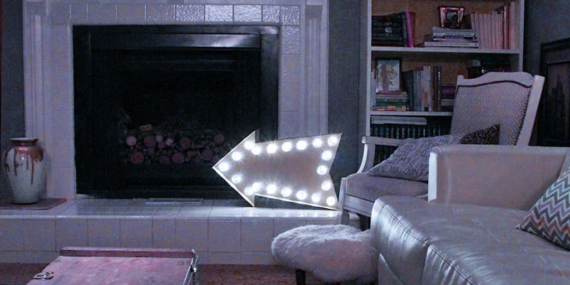
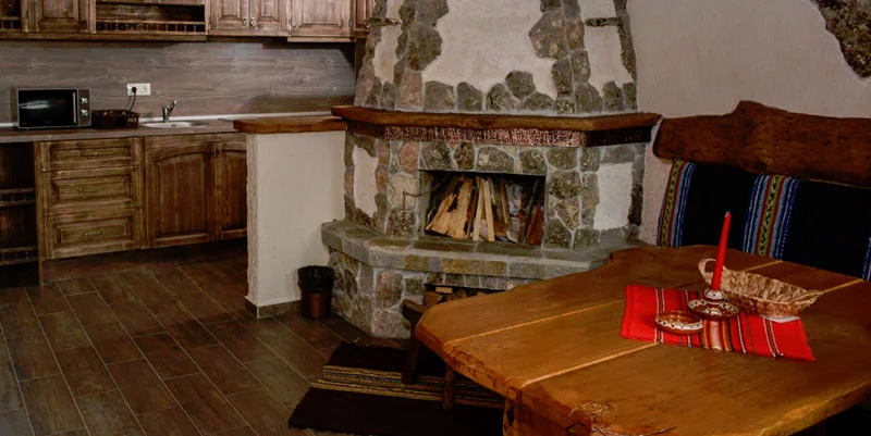
The simple act of having a light pointed towards whatever you want them to interact with is a fantastic and gentle way to generate curiousity to the group. When there’s a lot of things to interact with, but only one has a light pointed towards it—you’ll probably investigate.
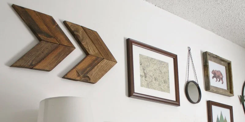
3. Hidden Arrows

This one is extremely subtle but very real and one of the oldest tricks in the book. If you’ve ever felt yourself compelled to look at something in a printed advertisement, it’s not by chance: they designed it so you would focus on what they wanted you to look at.
Carefully placed props with a clearly defined edge (so curves are okay too) can guide the eye towards something of interest. They don’t have to be long ones either—quantity can compensate and at times be even more compelling for the eye. Angle them so they form a triangle and it’s even stronger as the eye will always travel to where it ends.
4. Colours
We’re used to colours affecting our decision making in everyday life. Red for stop and green for go. This one you want to be more careful with as 1 in 12 men are colourblind (8%), so you risk your intentions being missed out on entirely. 1 in 200 women are colourblind, so while a smaller number it’s also something to consider.
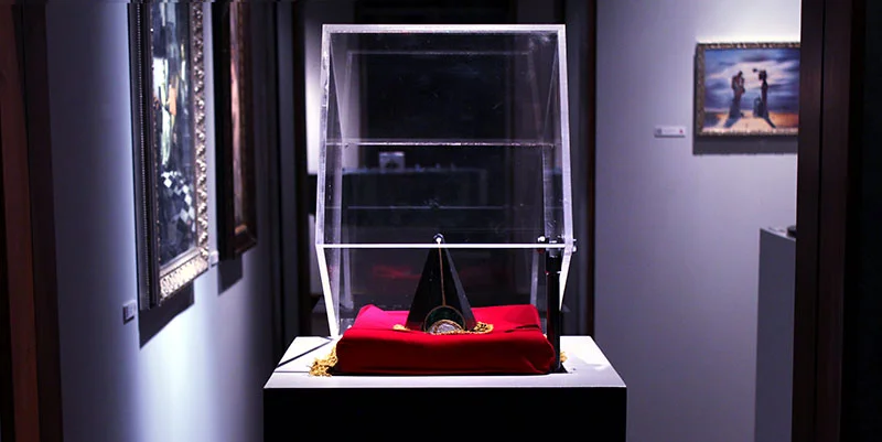
It can however be a very easy way to flag something as an object of interest. In a pile of boxes, one has some red marks on it. One painting is more colourful than the others (which is also making use of patterns).
5. Symbolism
Symbols are everywhere, from stop signs to very obvious arrows. This may seem to contradict one of the points raised at the start with not wanting to pander or make the suggestions too obvious, but if done correctly in a way that doesn’t break immersion, it can work well. Keep things simple. If a box requires objects placed into it, stick some arrows on it. Better yet, sneak the arrows in so it's not immediate obvious you used an arrow, but it still works like one.
It's Actually Important
You don’t need to use any of these techniques. In fact, most rooms out there don’t and may never do it. But if you’ve ever noticed people interacting with the wrong things first, trying to open every object that remotely resembles a container, or completely missing a crucial part of the game—it’s probably because your visual design needs some serious love.
Fortunately here at Immersive Tech we’ve got decades (if you add us up!) of experience designing visuals and gameplay for humans in video games, websites and advertisements. Contact us to improve your escape room!
